Dude, lay off my
ubiquitous Dutch weener
July 27, 2007
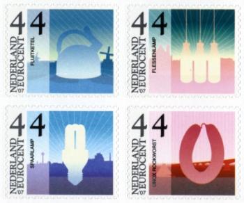
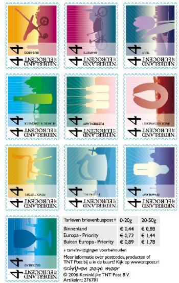
Dutch postage stamps with images of quintessentially Dutch design items incl. HEMA tea kettle Lapin. Producers of the objêts du design Ne’erlandais paid big dosh to have their stuff immortalised.
In Dutch media circles this time of year is called ‘Cucumber Time’. Supposedly all of our real journalists are on holiday 4 to 6 weeks somewhere sunny, and consequently here in the Heimatt there is a dearth of real news. This is the tempest in a teacup time of year, when it rains and rains and rains and rains and rains and rains and Dutch people tell you that it’s been a great summer. After 20 years of living in the Netherlands I still can’t figure out what this has to do with cucumbers.
The logo of the HEMA corporation
If you’re hip to the Dutch news you certainly already know that the quintessentially Dutch ‘five and dime’ department store HEMA, is threatening the equally Dutch cultural platform Mediamatic with legal action due to an alleged brand infringement. On August 24, Mediamatic will open the exhibition titled El Hema which explores how Arabic culture is influencing the Netherlands. The exhibition intentionally challenges the notion of Dutchness by combining Arabic visual culture with that of the HEMA.
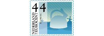
Quintessentially Dutch tea kettle on a postage stamp
Many Dutch people think of the HEMA as an expression of Dutch culture in the same way that IKEA might be considered to be an expression of Swedish culture. The HEMA is a store that sells normal stuff for the folks that consider themselves to represent the norm. The products are of good quality and the HEMA goes to some length to ensure that they are produced ethically. HEMA products (home, kitchen, office, food) are both folksy and ‘designed’ in a formal language that after 20 years can sometimes git up yer nose with its relentless practicality and cultivated quirkyness. HEMA design products are so ubiquitous that there are very few Dutch people, and by ‘them’, I mean ‘me’, that do not own that famous tea kettle that is considered Dutch enough that a corporate entity paid to have it immortalised on a postage stamp. Design is a really really really important part of Dutch culture.
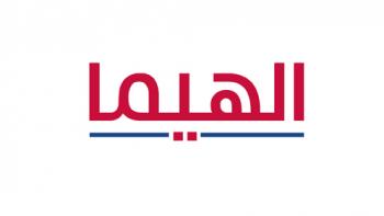
Huda Smithuijzen Abifares & Tarek Atrassi’s new logo
But what does that have to do with Arabic culture? Enter the Khatt Foundation, who have been conducting the brilliant Typographic Matchmaking Project in which an international group of graphic designers have teamed up to design Arabic companion typefaces for Dutch (Latin) fonts. Why is this important? Imagine that in the name of intercultural dialogue you need to design a poster in more than one language, using both Arabic and Latin typefaces. Imagine that your message speaks to more than just one cultural group. Turns out, 3-4 Latin typefaces are designed in the Netherlands every day, but in the Arab graphic design world there are only a handful, and from the point of view of some graphic designers, not all of these are suitable for use in conjunction with Latin typefaces. Now this is when design can get really important.
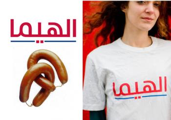
Ubiquitous HEMA weener interpreted by El Hema Halal
In the Netherlands, Thursday night is ’shopping night’ and in preparation for El Hema, Mediamatic has appropriated the koopavond for involving more people in the development of the exhibition. Although the evenings are not officially open to the public, an invitation is probably just a phone call away if you truly have something to add. The atmosphere is definitely inclusive. Yesterday after an intense telephone discussion with a colleague who insisted there was ‘no such thing as Arabic culture, the term having merely been invented to indicate countries belonging to the Arab League,’ I arrived at Mediamatic in time to view a mini Arab cinema screening, several articulate presentations of companion fonts by graphic design students from Beirut and Dubai and to dine upon delicious Persian food. Yes, Persian. Don’t say it, and don’t get me started.
The El Hema koopavond audience represented such a thorough mix of people interested in and connected to Arabic culture, that Mediamatic founder Willem Velthoven said, ‘Forget J-date, El Hema koopavond is home to all the hot mishpocha.’ Or something like that. I’m not a real journalist.
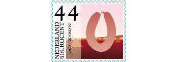
The ubiquitous UNOX weener, not to be confused with the ubiquitous HEMA weener
-
The 10 for the Netherlands series (2007) depicts:
1) the guild glasses of Andries Coupier (for Royal Leerdam)
2) the Revolt chair by Friso Kramer (for Ahrend)
3) Heineken’s Longneck bottle
4) the Bugaboo pram by Max Barenburg (for Bugaboo)
5) Tea kettle Lapin by Nicolai Carels (for HEMA)
6) Tejo Remy’s bottle lamp (for Droog Design agency)
7) the bakfiets (Fietsfabriek)
8) the Philips eco-lamp
9) the smoked sausage (by and for Unox)
10) the tulip (just read the Embarassment of Riches by Simon Schama)
- El Hema at Mediamatic
August 24 - November 3, 2007
visiting address office & workshops:
Post CS building
5th floor south
Oosterdokskade 5
Amsterdam
t: +31 20 638 9901Not to be confused with the REAL HEMA
Mediamatic’s El Hema shopping night # 6
Typographical Matchmaking Project, an initiative by Huda Smitshuijzen Abifares
Graphic designer Tarek Atrissi’s graphic design blog
FYI - Although Arab culture is not synonymous with Islamic culture, the month of Ramadan in 2007 will start on Thursday evening, the 12th of September, and will continue for 30 days until Friday, the 12th of October. The end of the fasting month Eid al-Fitr will be celebrated by observing Muslims on the sunset of Thursday, the 11th of October. Hindus begin the Navratri fasting period the very next day.
debra at 14:33 | | post to del.icio.us





Lovely, this love post. Mm, hm, I feel like hot mishpocha already. One thing: El Hema’s logo was designed by Huda Smitshuijzen Abifares (one person) together with Tarek Atrissi.
Comment by Nadya — July 27, 2007 @ 15:39
Fixed. And you’re totally hot.
Comment by debra — July 27, 2007 @ 17:19
Fixed. And you’re totally hot mishpocha!
Comment by debra — July 27, 2007 @ 17:19